Poster research
styles of posters
Contrast in colours
|
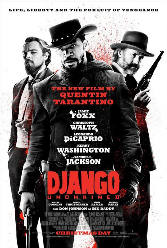
I found a style in posters where it would mostly be black and white, but with a splash of the colour red. I found this extremely effective as it instantly showed the audience that this is a serious film, and the colour of red connotes that there is some sort of danger, or blood, or action. I chose this style to analyse as I am seriously considering to use this style within my poster. I have lots of different ideas, and this is one of mine. The poster on the left I find extremely effective; We see that this film has some action in it because of the props of the guns, and we also see it by the splashes of red blood. The colour scheme is brilliant; I love the black and white characters, and the red titles. I find it very effective as it really stands out over everything in the scene, making us look straight towards "The new film by Quentin Tarantino", followed by "Django Unchained", and lastly "Christmas Day". Firstly, the reason they put the name Quentin Tarantino is because it is such a big name. The big name will draw in viewers who don't know anything about the movie, but only know the famous director. Secondly, the biggest title they put is the name of the movie (that is in red), which is very obvious, as they want people to instantly see the name of the movie so that it is memorable and so that it can intrigue them.
|
Double Exposure
|
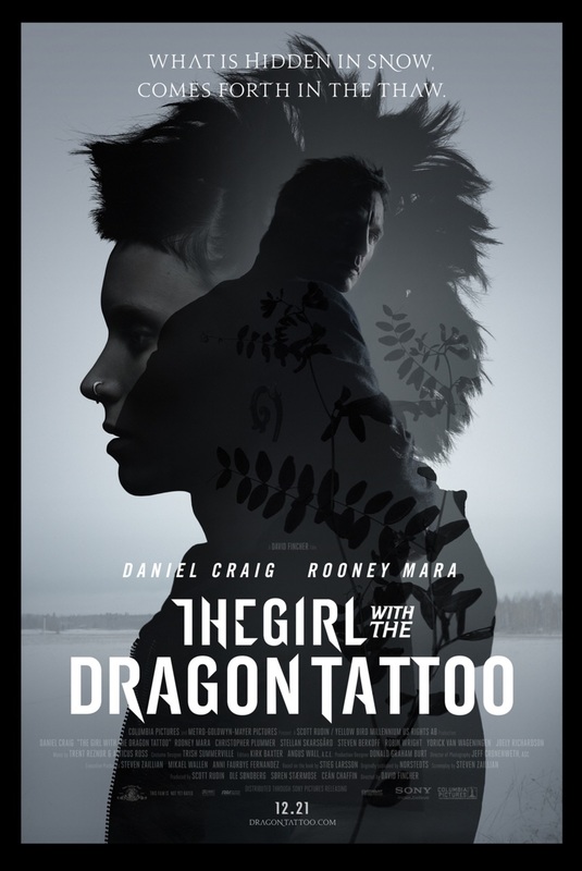
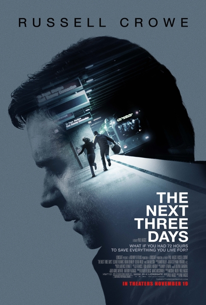
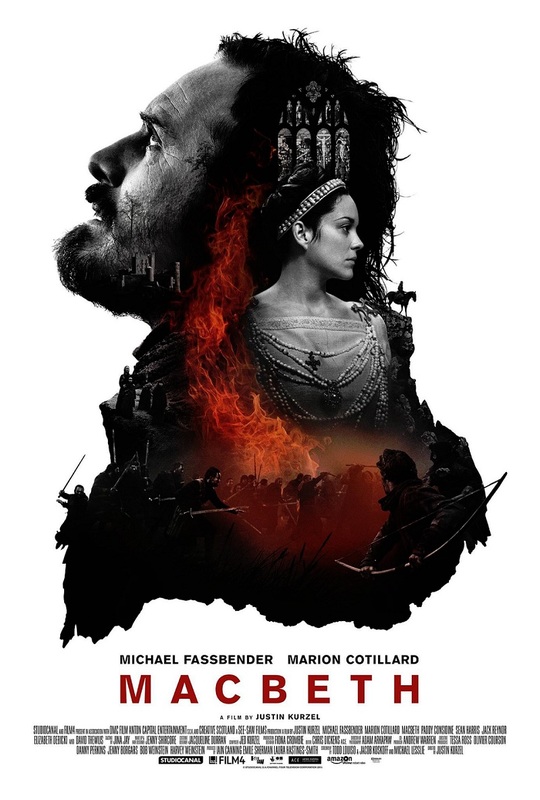
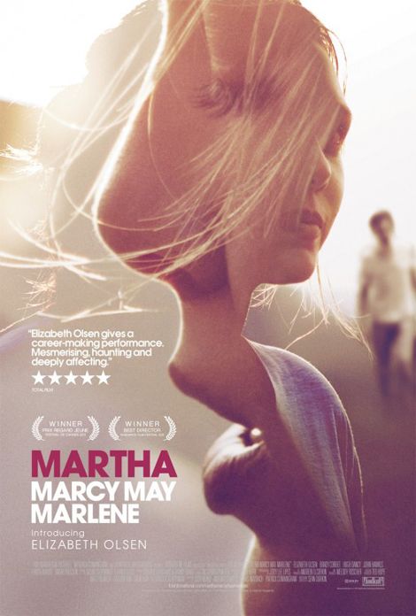
This style of poster is visually pleasing, as it allows different images to connect together into one image in an artistic way. The double exposure within "The Girl With The Dragon Tattoo" allows the foreground to contrast with the background, but still having elements within the woman's face. The black and white gives the feeling of mist, and coldness; this may show the coldness of the characters. With this style of poster you are able to collaborate an important background, or an important scene within the main image, without making it look tacky, and simply placed on. With this technique it is very necessary to have great photography, seeing all the strands of hair, as it creates a beautiful look to it. With this style of poster you need the background to contrast with the foreground, so usually the background is quite plain, as there is a lot going on in the foreground .This style has been used for 'The Next Three Days', 'Macbeth', 'Martha Marcy May Marlene', 'The Iron Lady' and more. It can be used for many ways; to combine a background with a main character, to combine multiple characters, or to have an artistic look to it where it combines two characters together, like in 'Martha Marcy May Marlene'.
|
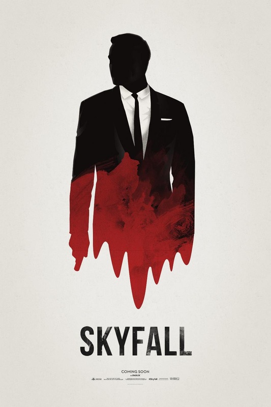
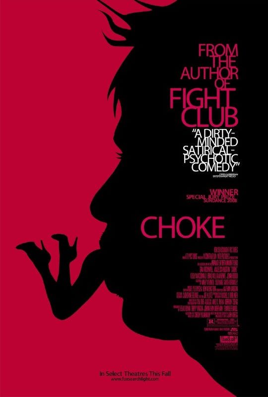
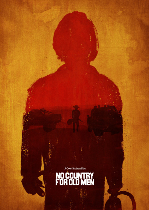
Silhouette Posters

|
I was intrigued by this method of poster design, as it hides out a main character, showing other characters within it. I feel that this style of poster is used to hide a character which has not been fully shown in the teaser trailer, in order to build suspense towards seeing this character. I find these posters artistically beautiful, and I find the style very clever, as hiding a character can build a lot of suspense, for example Luke Skywalker (Mark Hamill) in the new Star wars VII. I like the ones which are a simple silhouette like 'Choke' and 'Skyfall', as it adds mystery and is visually beautiful, as of the contrast in the colours. But I also like the ones from 'No country for old men', and 'Let the bullets fly' as the textures are stunning, and the the photos within the silhouette give hints towards the film, as well as making it look complete. The poster for 'Let the bullets fly' is nice as it shows hierarchy within the three characters shown; The character with the highest poser has been put at the top, to show that he is the most powerful. We know he has the most power as of his coolness in his expression and the glasses he is wearing. I would say the man in the middle still has power, but not as much as the man at the top, but the guy at the bottom looks scared and threatened, which is why he is at the bottom.
|
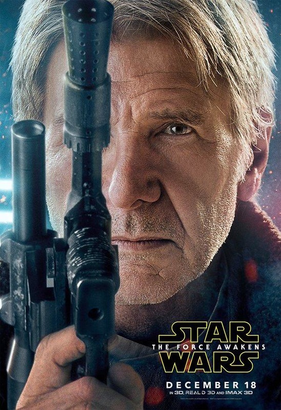
Character posters
|
|
|
|
|
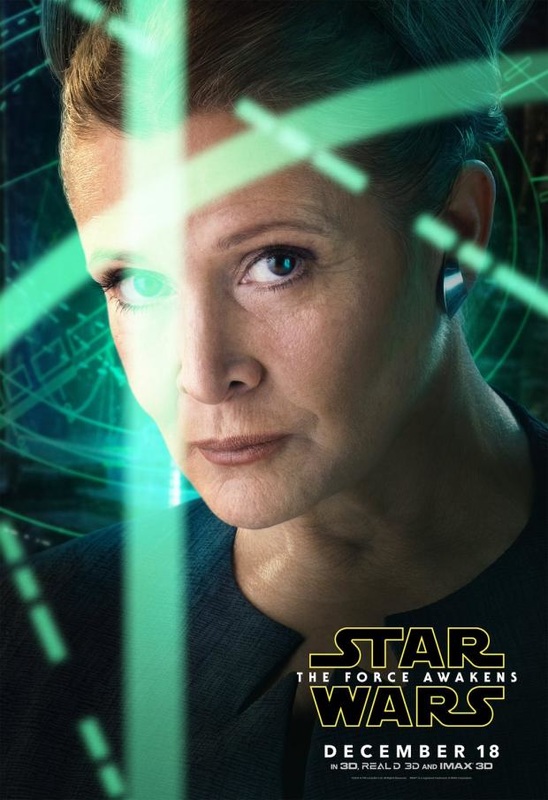
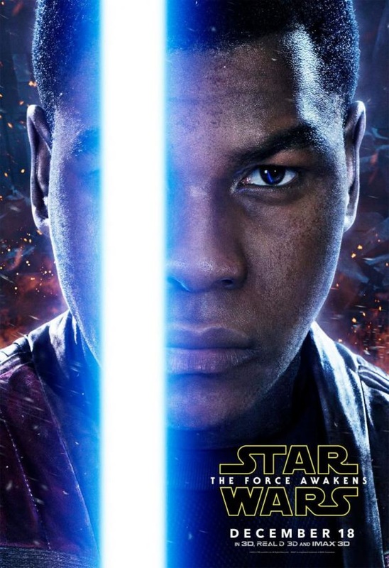
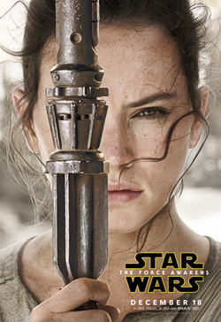
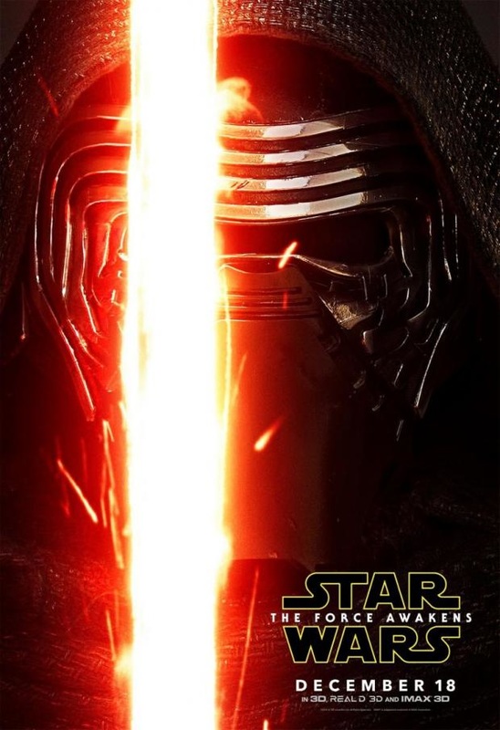
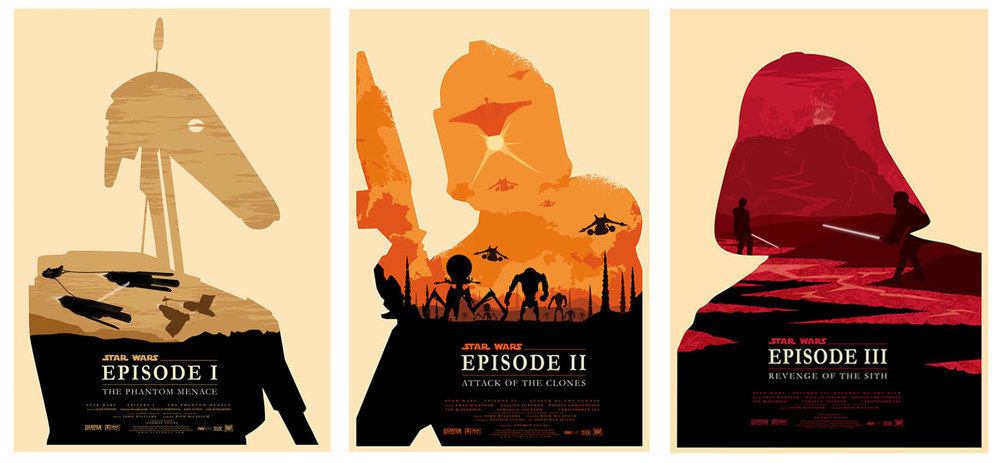
I really like character posters, as the individually take characters out of the overall scene and place them separately, which is actually what I like a lot in movies; character depth. I like seeing the backstories in characters, and my view towards them changing on the journey. Star Wars has many big characters, which is why they made 5 character posters, starting with 2 original characters which people already lover and know the backstories of, and three more characters which people want to find more about. All of these Star Wars posters connect, as in all, one eye is covered. All the strips that cover the eye all resemble the number "1", as this is the first movie in the new trilogy.
Star warsI chose all of these posters as they are all from the star wars movies, and they are all set out the same way. Initially, we see the main image, which each link to what the movie is about; so for episode 1 there is a droid as the Phantom Menace is about a droid war, for episode 2 there is a clone trooper as the movie is about the Attack of the Clones (and so on for the rest of the movies). This is done to give the audience a picture to focus on, while using the foreground as a background in a way, so that they can use a background image as a foreground. Inside the silhouette of these characters we see the backgrounds of the planets that the movies are set on (to give setting to the picture), so for example "The Empire Strikes Back" has a silhouette of Bounty Hunter "Boba Fett" (as he is a big character in the movie), and within the silhouette we see a city in the clouds (Cloud City) where we see the city taking the shape of a section of Fett's mask, a moon taking
|
|
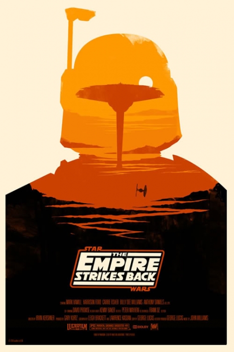
a shape of a section of the mask, and a little silhouetted ship at the bottom. All of these images relate to the movie, enabling it to tease the audience by giving little hints about what it is about. The posters are all visually beautiful, and do not have a tagline which overcomplicates things. The poster includes standard things like the name of the movie, and all the information at the bottom (including things like LucasFilm). I think that these posters were made after the prequel had came out, so they were not using these posters to get people in the cinema, but I do think that this poster was worth analysing as the style is visually amazing and is something I could do when making my poster.

|

|

|
The dark knight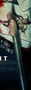
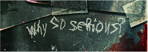
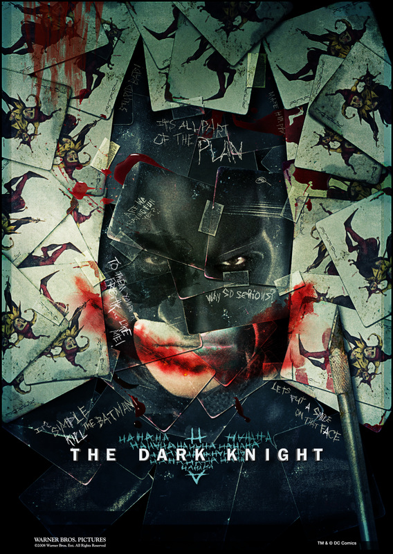
I chose this poster as I researched the trailer of this film, so now when I analyse it I will be able to see the link between the two. The poster is very overwhelming as there is so much going on; the whole medium of the image are lots of different Joker cards scattered together. This initially represents the main villain in this movie (who is called the Joker), but what is special about the cards is that it ends up showing Batman's face. This poster is in the point of view of the antagonist 'The Joker', as there is blood on the cards making a smile, a knife, and cards which are etched into. The cards are connected together with tape, which makes it look as though it is handmade, which adds to the effect that the Joker made this poster. The character of Joker has his mouth cut into a smile, so the fact that there is blood splattered on the mouth shows that Joker thinks that Batman is just as much of a freak as he is. The prop of the knife shows the type of person that the joker is, as he is more of a insane cutting man. Additionally, we see loads of etched words on the cards, which are in fact phrases that the character says throughout the film. Behind the title "The Dark Knight" is the symbol of Batman, but with the onomatopoeia of "HaHaHaHa" (as the Joker has a signature laugh). This links to the teaser trailer of The Dark Knight as at the end of it we see a Joker card fly in the audiences face, presenting the character of The Joker.
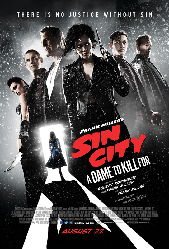
sin city
The poster for 'Sin City' has been set out like a comic book, with the angle of the shot, the font, the lighting, and the tagline especially. This has been done as this movie was based off of the comic book; The poster links to the trailer, as in the trailer we see this woman with green eyes, red lips and red nails. The lighting is very strong, almost like a film noir movie, with the light coming from the blinds shining on her eyes and her lips. The woman in the photograph is extremely seductive, wearing very revealing clothes with red lipstick, red nails, alongside the tagline of "I've been especially bad". This would instantly attract male audiences, making them feel intrigued to see it as it mixes both violence and sex together.

|


|


The title is pretty unique compared to many other ones; The title is slanted and is on the left instead of being in the middle, which reminds me of the way a comic book presents its title, when they make a full page of something happening, but with the title included.
shutter island
|

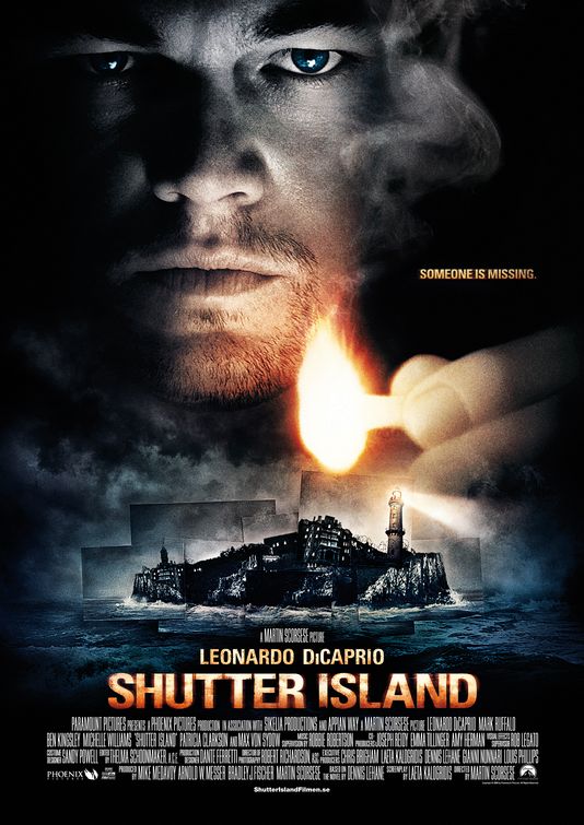
The poster for Shutter Island Is dark and mysterious, with a dark blue tint added. The colour scheme used was black, dark blue and a orange/yellow; This colour scheme is effective as the darkness adds ambiguity as well as mystery, and the little areas of light makes the audience feel that he is isolated, alone and in the dark. He has the match close to his face, but also below it is the main setting; the island. The colour scheme links with the colour scheme of the magazine cover, as well as the trailer, as within the trailer there are many dark tinted shots.

The main image on the poster links to the teaser trailer title that introduces the actor "Leonardo DiCaprio" This tells the audience that this simple prop has some significance to the movie.

The tagline "Someone is missing" gives the viewer a small hint into what the movie may be about; the tagline
|

The image of the island with the lighthouse gives an insight into the location of this movie, as well as linking to the trailer and the magazine cover.
|

Most of the poster has a blue tint, but there are a few areas of warmness; the matchstick DiCaprio is holding, the tagline, the actors name, and the name of the movie. This has been done as these are the most important parts of the poster; The matchstick represents the tiny bit of light left within the situation the person is in, the tagline gives a small insight into the storyline of the movie, the actor's name is what draws people into watching the movie, and lastly the name of the movie (the most important bit) is the largest, so that people will remember the name of the movie.
|
posters used as inspiration for ideas
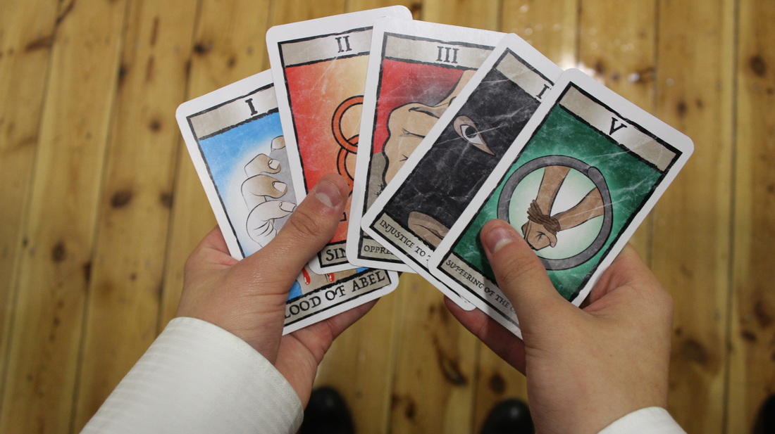
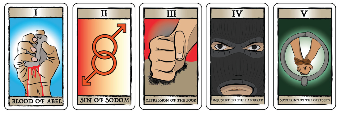
This relates to our poster as cards are a main part in our trailer, and this specific poster inspired me to have a design where I would use my cards within it.
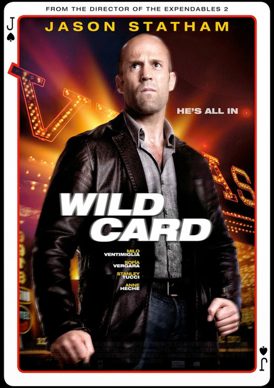
We were thinking of using this poster as inspiration, where the actual poster takes the form of a playing card, but instead it would have the top and bottom bars of the cards that I created.
|
|


thumbnail sketches
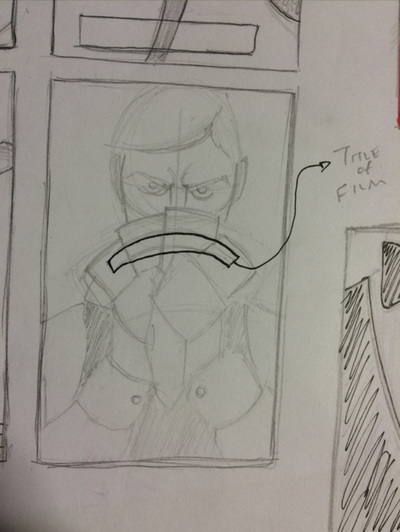
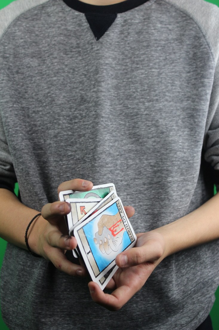
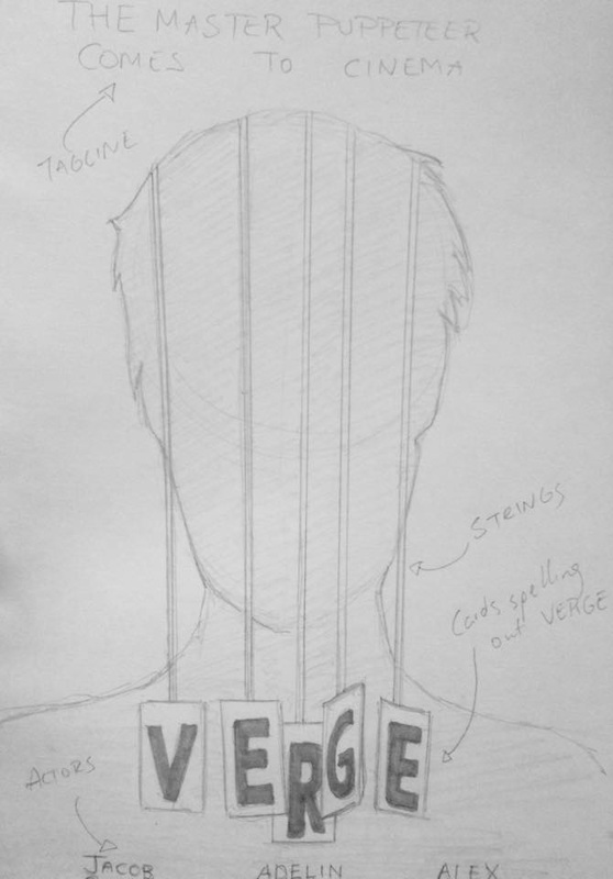
My initial idea for the film poster would be to have our main protagonist in the shot, alongside his cards. I wanted this as he is the main character, and the cards are a main prop, which portray 4 other characters. I thought it would be a lot better to have the cards in the poster than to have all the characters, because I feel it will make it feel overcrowded. I was thinking to have the title of the film on the back of the cards, allowing the foreground to interact with the title, making everything connect into one piece. I wanted to show part of his costume, to reveal the type of person he is through mise-en-scene, as it will make people curious about who this man is, what he is doing, and why he is doing it.
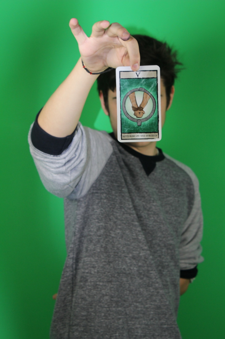
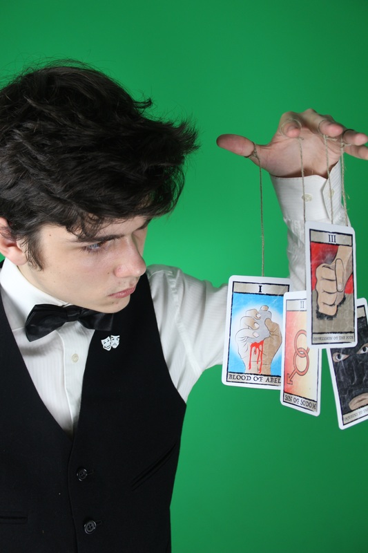
This is quite similar to the previous sketch, but instead we show a close-up of just the hand holding the cards; I thought that by doing this it would show mystery, as throughout our trailer we try not to show the main character's face, so we wanted the poster and the trailer to link together in that way.
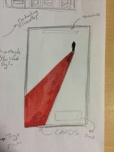

As a group we were talking about a red carpet, and when we saw this poster on the left We had an idea of the main character walking away, but leaving a trail of red cards, which almost look like a red carpet. The reason for a red carpet is that the character is a performer.

This idea is similar to a lot of my other ideas, as I feel like silhouetted posters create a nice effect. This would create mystery as you do not see his face, but you see his suit, which is part of the person's character. White and Black creates a giant contrast, but this is something I may not do, as it doesn't full portray what I am trying to show through the poster, about how he is controlling.
|
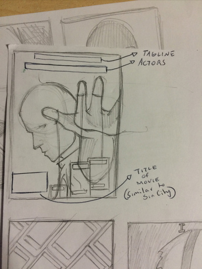
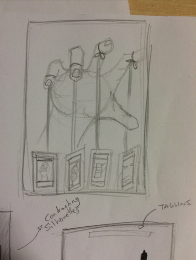
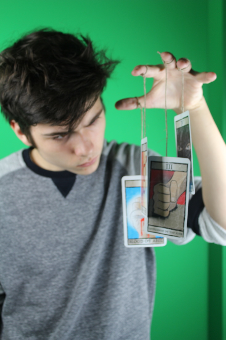
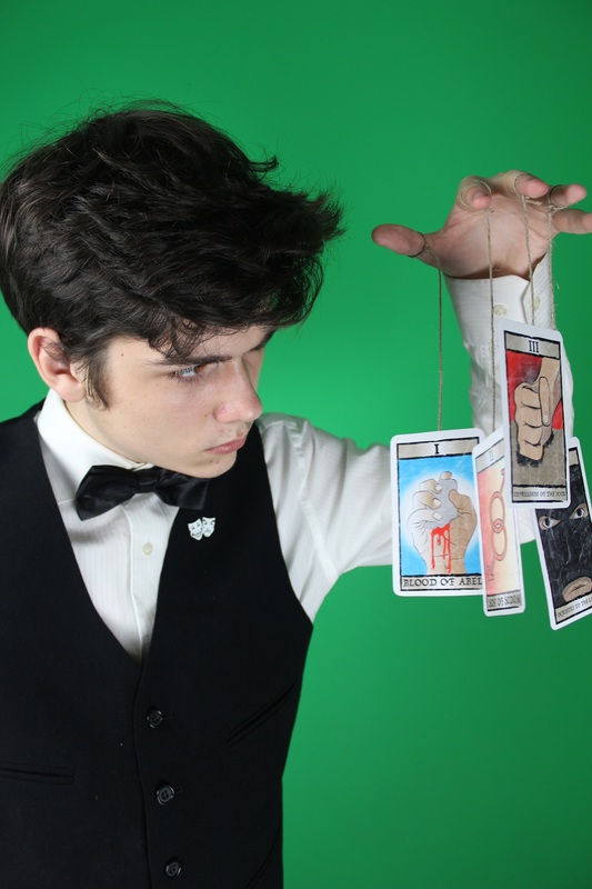
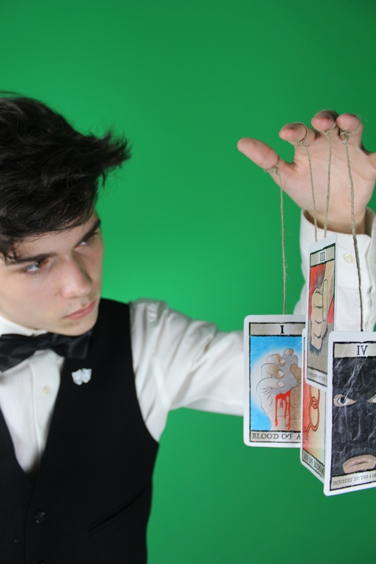
I was inspired by the symbol of the Godfather, which showed the hand of a puppeteer. Throughout our trailer we show that this man is the person controlling the other people, he is the composer to all these crimes, so I came up with the idea of having strings tied around his fingers, which hang down and are attached to the cards, showing that he is controlling these four people.
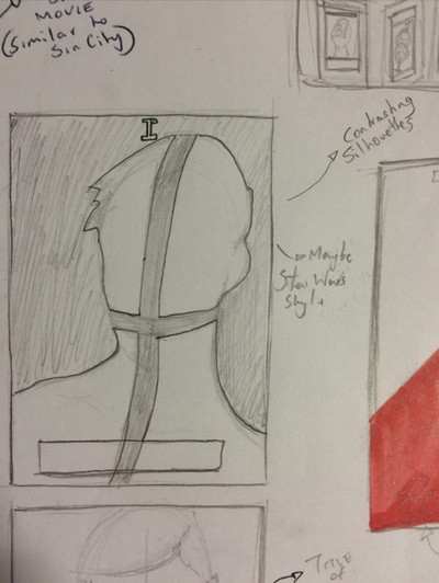

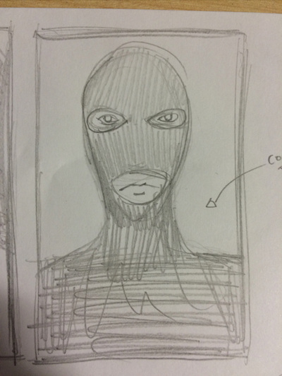
When I looked at several posters I thought to myself that they looked quite messy and very easy to do, so I told myself that I would make quite an artistic poster, which I would put a lot of effort into; So i came up with his idea where there would be a silhouette of the character (with the black cross added to show which character it is), but I don't want to leave it as that, I wanted to add important backgrounds and objects inside the silhouette poster like the Star Wars poster on the right.

Here I took inspiration from The Dark Knight where cards are scattered around, so I thought that we could use our cards as they are a big part of our trailer.

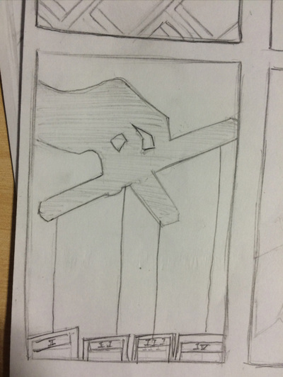
This is pretty similar to the previous one, but instead, inside the silhouette is an important location to the show. This is very similar to the Star wars trailers, which I really like the look of. I am still not sure if this is one of my favourite initial ideas because it still does not show anything about control.
|

practice photos
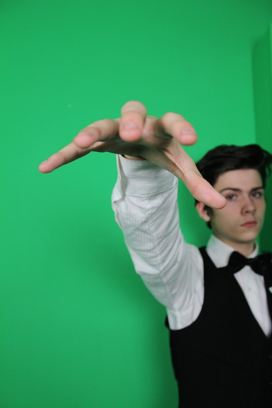
The photos below are ideas which I came up with that I wanted to try out to see how they work, so I got one of my partners to take a photo of me in the positions that I wanted to do in the actual photography. This allowed me to come up with the idea of having me looking at the cards and holding them up like a puppeteer, controlling them.

|

|
|
|
proper photography

|

|

|
tester posters
|
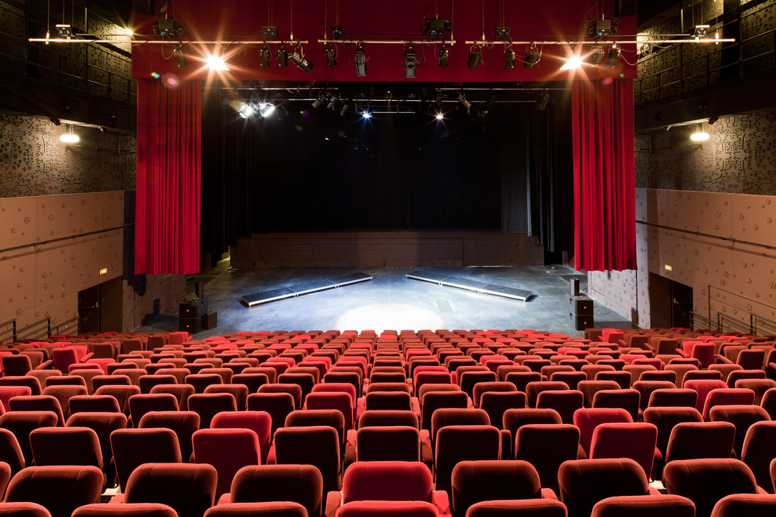
Here I was inspired by the Double Exposure technique used in the TV series "True Detectives"; I felt that this added some mystery to the main image/character, but at the same time adding a location that links to this character, as well as a backstory. Also, it simply looks visually beautiful. For this tester, I tried the technique where I took a photo which I used from one of the shoots and added a background scene of a theatre.
|

|

|
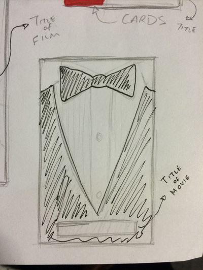
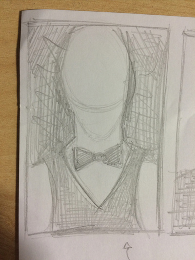
Next, I needed a photo of me wearing the suit, but we needed to do a re-shoot, so for the time being I used a picture of Justin Timberlake as I found the right type of photo I wanted, where he was wearing a bow tie. For this test I was inspired by one of the Dark Knight posters where lots of cards were laid out and resembled the form of Batman. I liked the idea of using cards, and the fact that our movie had cards within it too, I decided to mix the face of the person in the suit with the cards using layer mask. It looked better than the previous one, but I still felt it looked quite tacky and lazy.
|

|
the real poster idea
(sketch)
|
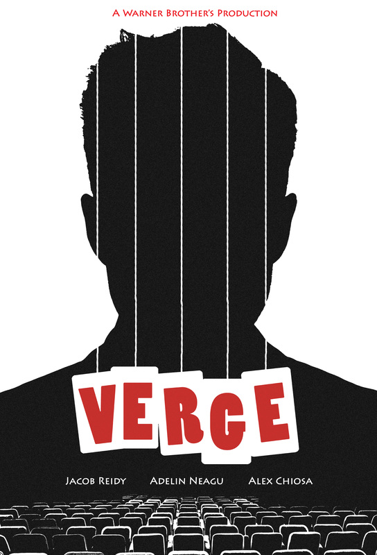
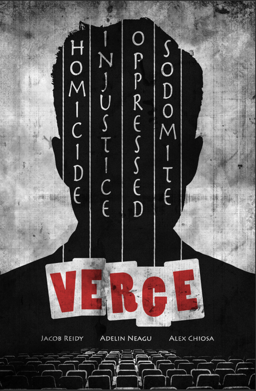
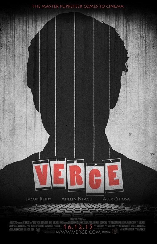
After all the testing with different styles of posters, I finally concluded and came up with an overall idea. I wanted the man to be silhouetted out so that there is a mystery about who the man is, as it links to the trailer we made, as we never actually show his face for a long period of time, only slightly in a quick flash.
|

I experimented making a poster with the style of the poster for 'The Imitation Game', where there is writing over the main image; I did this below with the names of the four characters which is being controlled by the main character (the guy who is a silhouette).
|
(borrowed photography for test, until we take the proper photos)


|
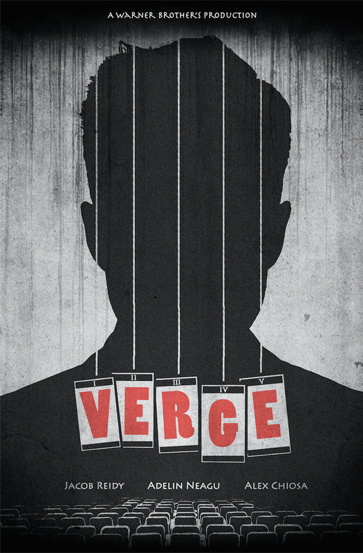
When making the poster I was experimenting with loads of different ideas and techniques, which I concluded on the style that I created above. I was inspired by quite a few things, I was inspired by lots of silhouette posters like Elena, where I got the idea of showing the main character's outline, but not his face, almost like when police do not know who the killer is, and they have a black silhouette with a question mark. Additionally, I used the cards within the poster, as they are a ginormous part of the movie. I did something quite clever, where I put each letter of the title onto each one of the cards, which fell together perfectly, looking aesthetic as well as giving hints into what the movie is about. Lastly, I was inspired by the texture of the poster for 'The silence of the lambs'. I've often wondered why the poster was made to look like this, but I've always liked the grain, so I decided I would try it out on mine, so I did and I felt it looked brilliant, and looked like an old theatre poster.
|

|
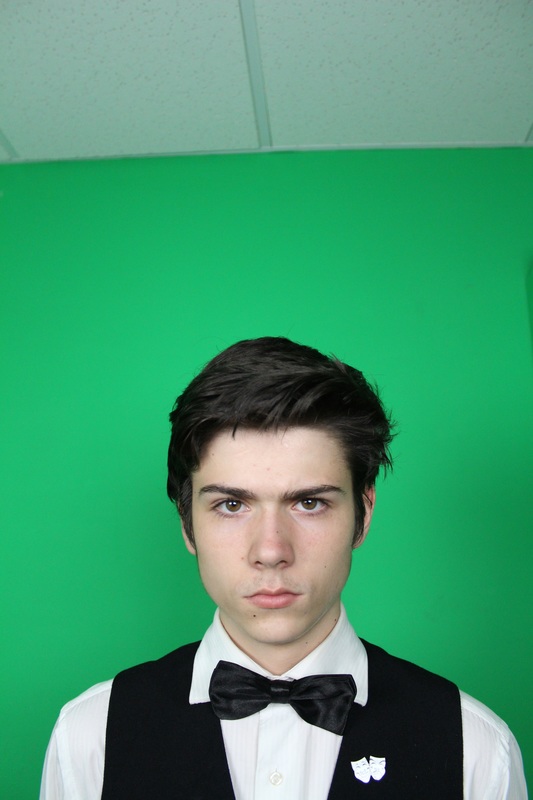
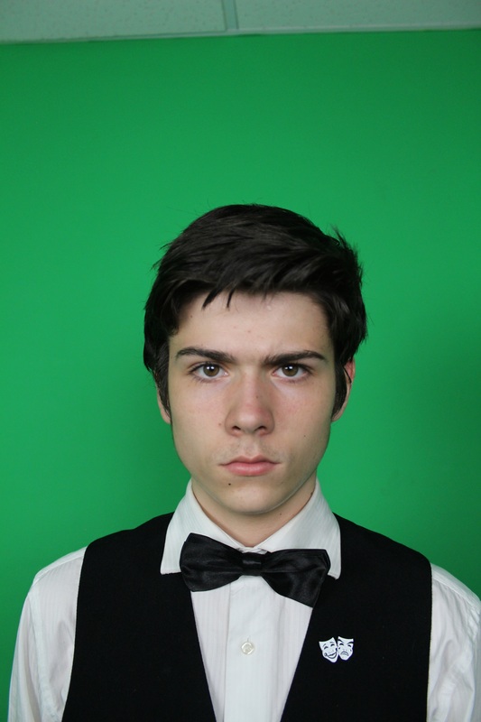
proper photography for my face
|
|
|

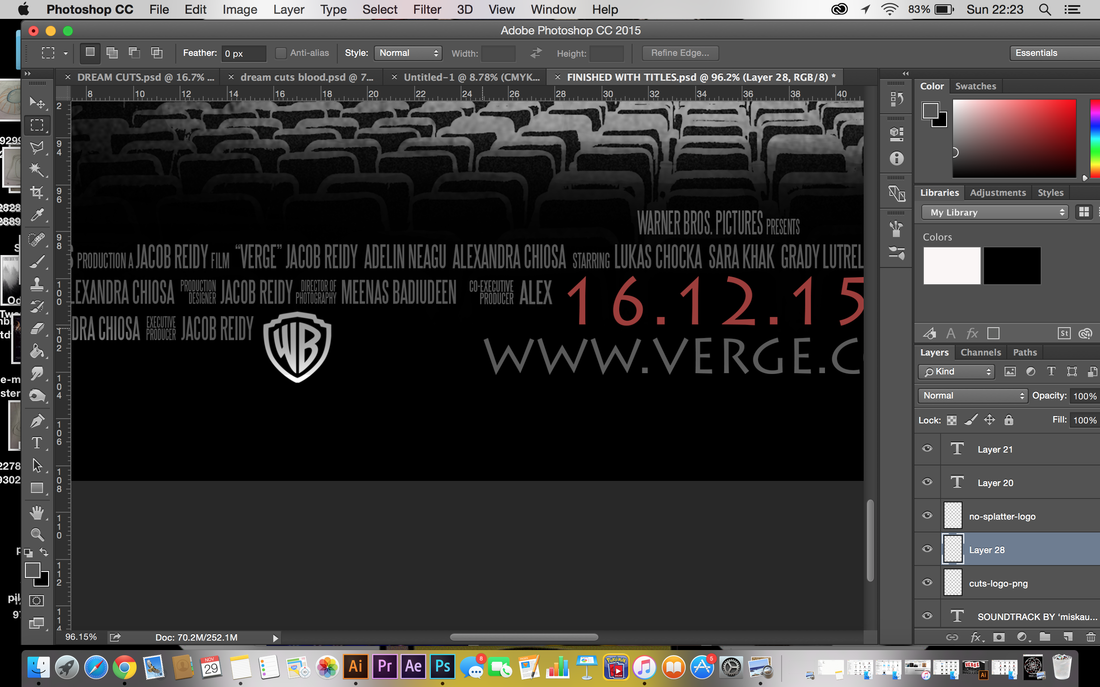
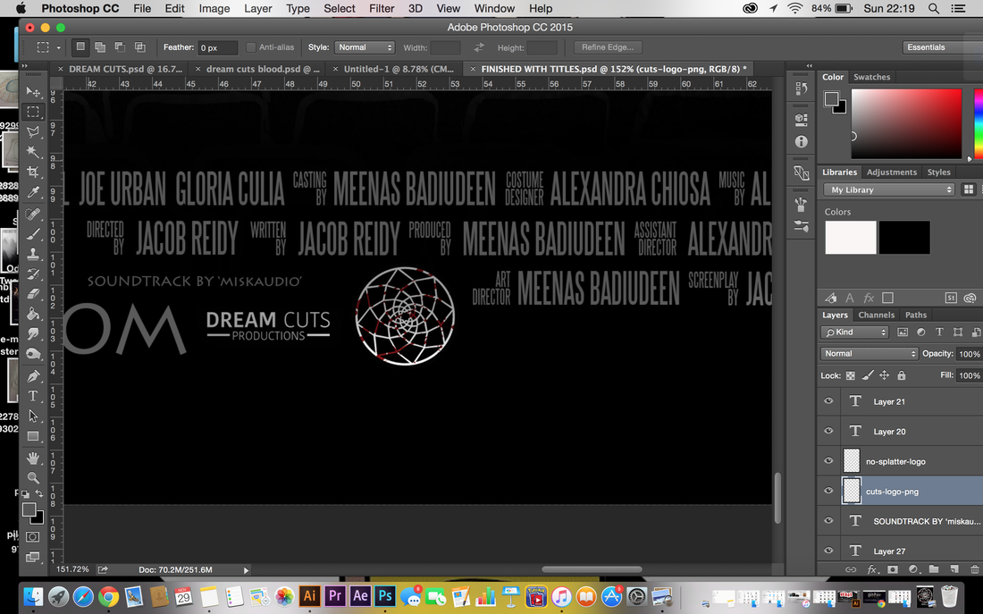
Here is the logo that I created for Dream Cuts (I have the process on my blog). In short, I made the logo like this, as it is the pattern of a dreamcatcher, which I then added blood splatters (representing dreams being cut).
|
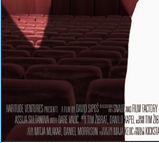
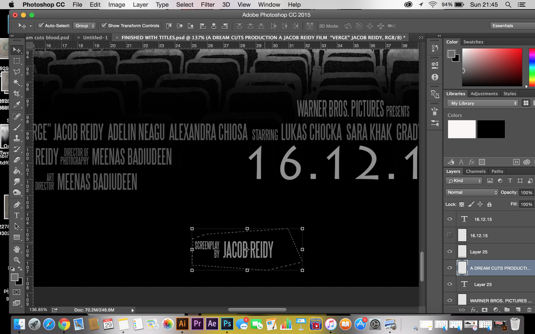
For added touches, I ordered the billing block in a way that it looked visually nice; I put the date in large font and placed it in the middle of the billing block, I had the production company's name separated from the rest and put at the top, and also I added the two companies (Warner Bros, and Dream Cuts) and their logo, both on either sides to make it look even.
|
(used photos for second poster)

|

|
|

| poster-with-locations-2.jpg |
finished poster
| film_poster.jpg |
